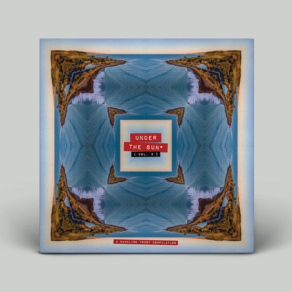
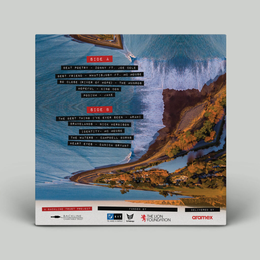
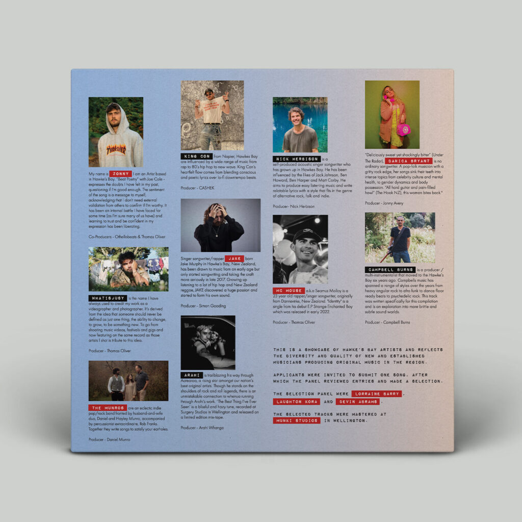
Hawkes Bay Music Hub approached me to be the artist & designer for their second Hawke’s Bay Musicians compilation album, “Under The Sun Vol. 2”. The album was to be published on streaming platforms, printed and pressed as a vinyl record and distributed across New Zealand to music industry professionals.
The Project
‘Under the Sun’ is an annual compilation album put together by Hawke’s Bay Music Hub featuring music from local musicians that is distributed across New Zealand to relevant music industry professionals in a vinyl record format. I was given fairly loose limitations for design style, and artwork / layout had to work with the featured musicians and sponsors of the album. I also had to work within brand guidelines for the those sponsor brands.
Deliverables: Artwork and Layout Design for a Vinyl Album; Front Cover, Back Cover, Insert and Side A / Side B labels.
Research & Inspiration
What I wanted from the start for this album design was an abstract but familiar feel, alongside some sort of ‘vintage’ element that would evoke a nostalgic feeling.
I also wanted to use impact labels to reinforce the nostalgic, reminiscent feeling of the artwork, I also really like the style that it creates so wanted to use this to emphasize parts of the text, instead of just making headings bold, etc.
With the album being titled ‘Under the Sun’, I straight away wanted to use the Hawke’s Bay coastline as the subject of the photos I would use. I felt this as appropriate as with all the stresses of the past few years, something that anyone could feel relaxed and laid back by. I also thought that using an image of the Hawke’s Bay coastline would evoke that ‘nostalgic kiwi holiday’ vibe from the viewer.
Concepts
I started the conception phase by using images I had already taken and manipulating them in my artistic style. I focused on the front cover, as that would then influence the artwork and design for the other areas of the album.
A selection of concepts:
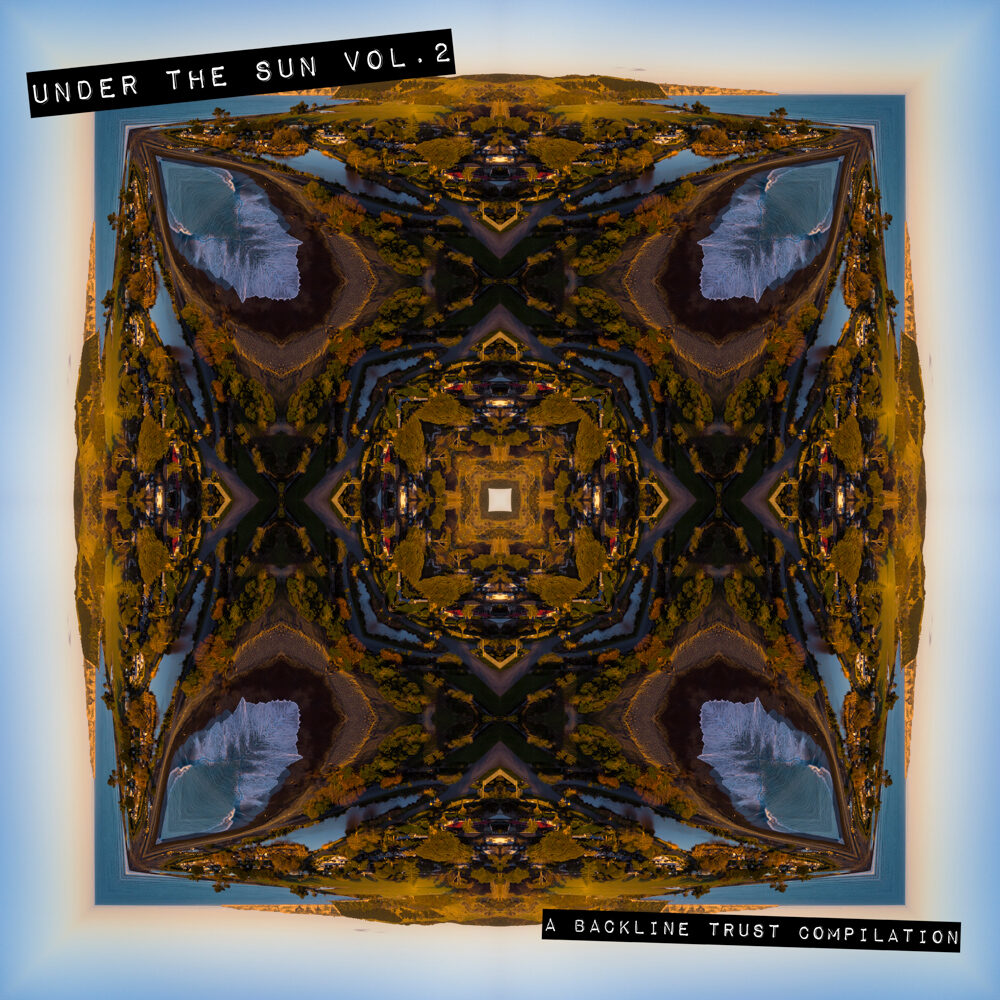
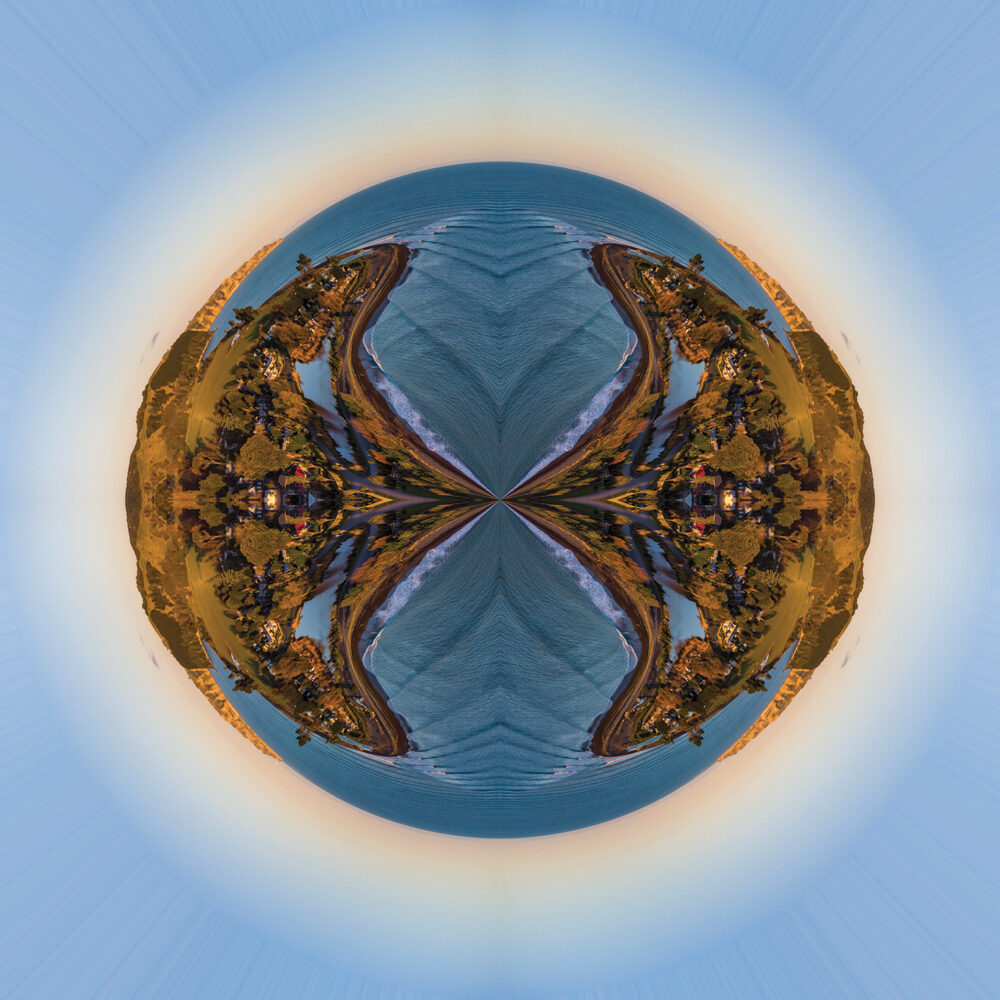
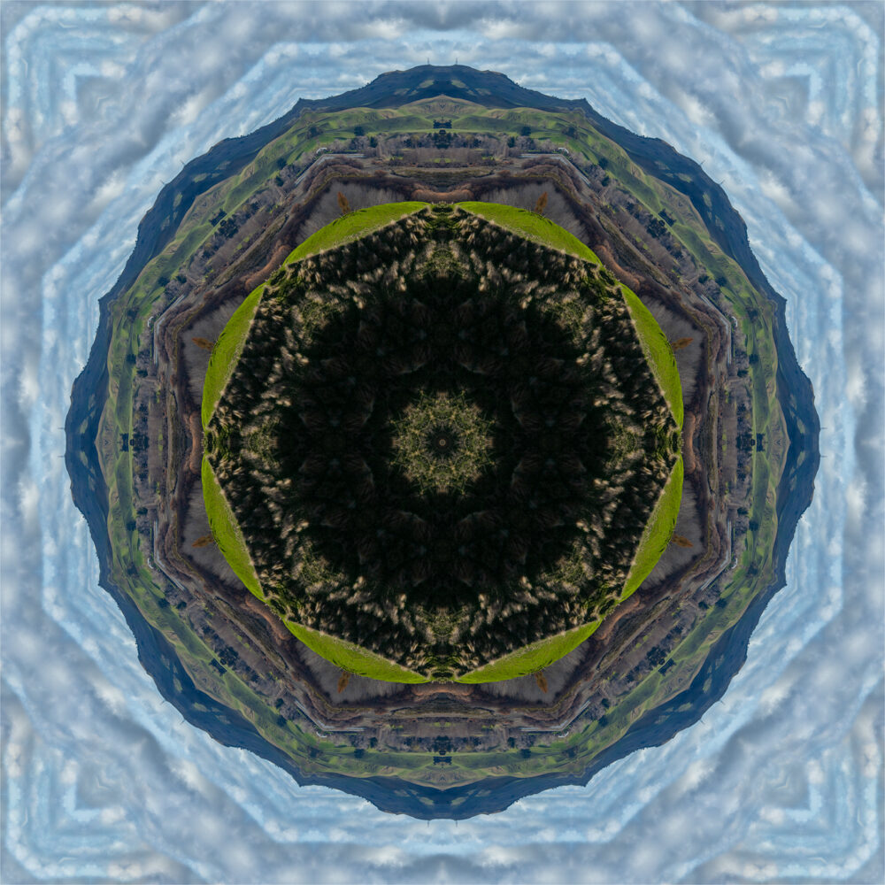
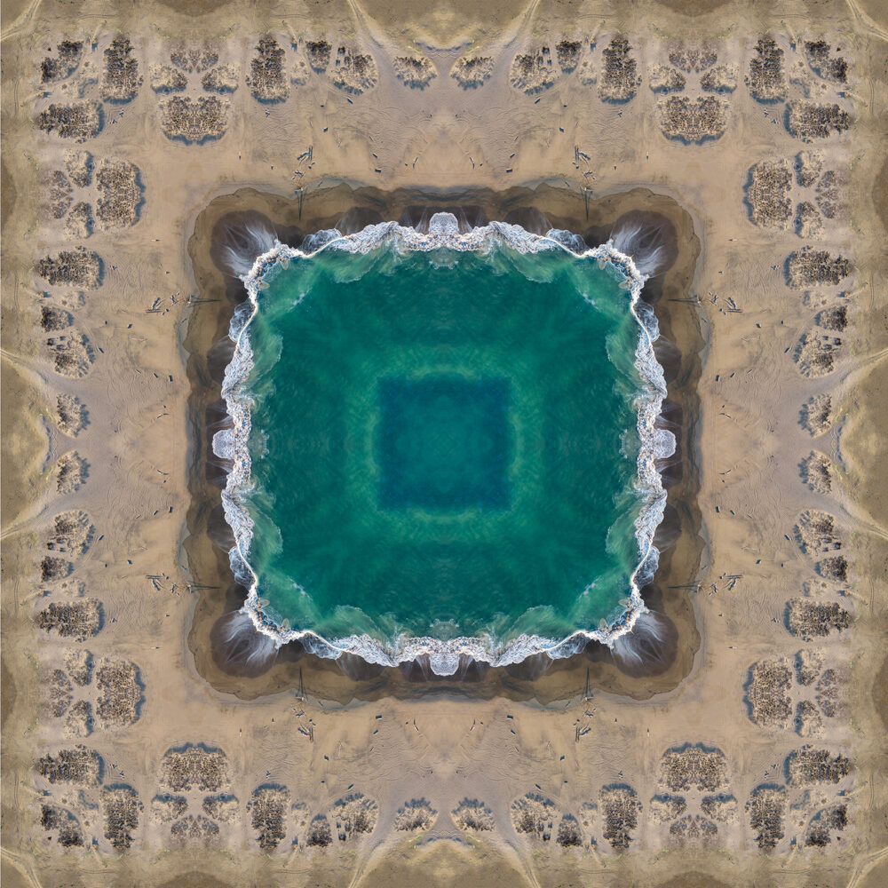
After discussing these concepts with the client, we selected a few and took down feedback for what they liked / disliked. The client preferred the concepts that were square, and less complicated. I agreed with this sentiment as the concepts that were busier would take away from the goal of the album too much, and wouldn’t align with wanting the album to be calm and familiar.
Development
After meeting with the client, I moved forward with developing one of the chosen concepts that I felt aligned best with their feedback, and started to layout the content for the other artwork areas. I decided to use the concept that had the sky act as a frame to the land area of the image. This also opened up the empty central area for the album title. I was very happy with how the impact labelling worked on top of the artwork, allowing for clear reading of text that would otherwise be difficult to place over an image where colour varies a lot. It also made important elements really stand out, especially for the artist names where they stood out from paragraphs of text.
Final Outcome
The final design of the album makes use of Hawke’s Bay’s golden coastline and soothing waves, with Cape Kidnappers / Te Awanga being an ideal subject for the project. The repetition of these elements across the design reinforce these feelings, and coupled with the impact labelling helps to evoke a fun, calming and nostalgic feeling.
